Wedding Colour Schemes: How to Choose
Key Takeaways
- Choose 2-3 colours maximum: a primary, a secondary, and a neutral — more than that looks chaotic
- Start with the season and venue — they naturally narrow your options
- Test colours against real fabrics, flowers, and your venue's walls before committing
- Sage green + blush pink is the most popular UK wedding colour scheme in 2026
- Your colour scheme doesn't need to be in everything — stationery, flowers, napkins, and bridesmaid dresses are enough
A colour scheme gives your wedding visual cohesion. When the stationery, the flowers, the bridesmaids’ dresses, and the table settings all share a palette, the whole day feels intentional and designed — even if you didn’t hire a stylist.
The secret: keep it simple. Two or three colours is all you need.
The 15 most popular wedding colour schemes
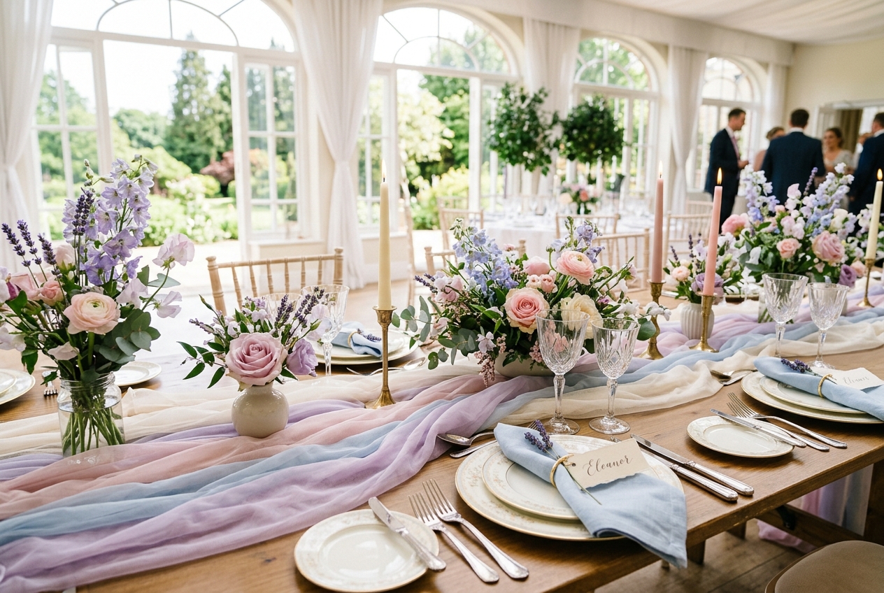
1. Sage green + blush pink
Why it’s #1: Soft, natural, and universally flattering. Works with greenery (sage) and flowers (blush) seamlessly.
Season: Year-round, but best in spring and summer. Venue: Gardens, barns, country houses, marquees. Flowers: Garden roses, peonies, eucalyptus, dusty miller. Bridesmaid dresses: Sage green or blush — either works beautifully.
2. Navy blue + gold
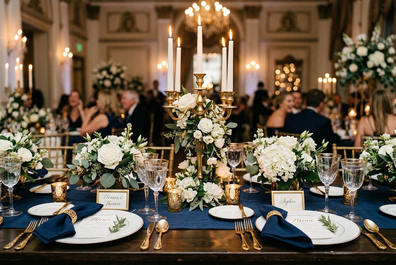
Why: Formal, sophisticated, and masculine-friendly. The groom looks great in navy and it coordinates perfectly.
Season: Autumn and winter, or formal summer weddings. Venue: Hotels, stately homes, ballrooms, city venues. Flowers: White roses, dark greenery, gold-painted accents. Bridesmaid dresses: Navy (universally flattering across skin tones).
3. Terracotta + burnt orange
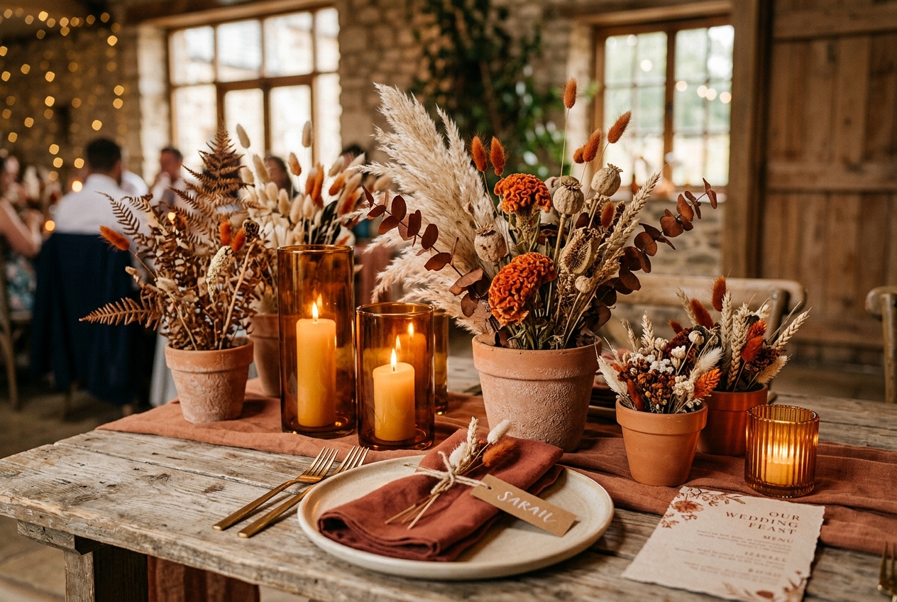
Why: Warm, earthy, and deeply trendy since 2023. Bold without being garish.
Season: Autumn (perfect) or late summer. Venue: Barns, outdoor, Mediterranean-influenced spaces. Flowers: Dried flowers, pampas grass, dahlias, roses in warm tones. Bridesmaid dresses: Rust, terracotta, or warm nude.
4. All-white + greenery
Why: Timeless, elegant, and impossible to get wrong. Green foliage provides structure while white flowers and decor create a clean, luxurious canvas.
Season: Year-round. Venue: Any — this palette works everywhere. Flowers: White roses, hydrangeas, ranunculus with masses of eucalyptus, ferns, and ivy. Bridesmaid dresses: White, ivory, or sage green.
5. Dusty blue + cream
Why: Romantic, calming, and beautifully photogenic. The softest palette on this list.
Season: Spring and summer. Venue: Country houses, gardens, coastal venues. Flowers: Delphiniums, hydrangeas, scabiosa, white roses. Bridesmaid dresses: Dusty blue in various styles (mix-and-match looks excellent).
6. Lavender + soft green
Why: Gentle, whimsical, and perfect for spring. Lavender is softer than purple and more interesting than lilac.
Season: Spring and early summer. Venue: Gardens, marquees, light-filled venues. Flowers: Lavender, wisteria, sweet peas, stock, lilac.
7-15 quick guide
| Palette | Season | Vibe | Bridesmaid Colour |
|---|---|---|---|
| Burgundy + blush | Autumn/winter | Rich, romantic | Burgundy or blush |
| Emerald green + white | Year-round | Luxurious, bold | Emerald or forest green |
| Peach + cream | Summer | Warm, cheerful | Peach or apricot |
| Black + white | Year-round | Dramatic, modern | Black (very chic) |
| Coral + teal | Summer | Vibrant, tropical | Coral or teal |
| Champagne + ivory | Year-round | Understated luxury | Champagne gold |
| Powder blue + silver | Winter | Cool, elegant, icy | Powder blue |
| Mauve + grey | Autumn | Sophisticated, muted | Mauve or grey |
| Forest green + gold | Winter/Christmas | Festive, grand | Forest green |
How to choose your palette
Step 1: Start with what you love
Open your wardrobe. Look at your home. Check your Pinterest boards. The colours you’re drawn to in life are the colours that will feel right at your wedding.
Step 2: Consider the season
| Season | Natural Colours | Best Palettes |
|---|---|---|
| Spring | Fresh greens, blossom pink, daffodil yellow | Pastels, sage + blush, lavender + green |
| Summer | Vibrant greens, bright flowers, golden light | Coral, peach, bright blue, white + greenery |
| Autumn | Rust, amber, deep red, golden brown | Terracotta, burgundy, navy + gold |
| Winter | Evergreen, silver, white, deep jewel tones | Emerald + gold, navy + silver, burgundy + cream |
Step 3: Check against your venue
Visit the venue and look at the walls, floors, curtains, and natural light. A warm-toned venue (exposed brick, wood beams) suits warm palettes. A cool-toned venue (white walls, marble, grey stone) suits cool palettes.
Bring fabric swatches. Hold them against the walls and in the light of the room. Colours that look beautiful on a screen may clash with the venue’s existing tones.
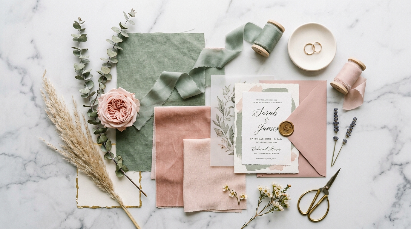
Step 4: Test with real materials
Order fabric samples, get a flower sample from your florist, and print a test invitation. Seeing real materials together is completely different from looking at a digital mood board.
Where to use your colours
High impact (everyone notices):
- Bridesmaid dresses
- Flowers (bouquets, centrepieces, ceremony)
- Table linens (napkins, runners)
Medium impact (adds cohesion):
- Stationery (invitations, place cards, menus)
- Cake decoration
- Ribbon and finishing touches
Low impact (subtle consistency):
- Favour packaging
- Groom’s tie or pocket square
- Confetti
- Candles and candle holders
You do NOT need to match:
- The venue’s existing decor (complement, not compete)
- Every single item (that looks obsessive, not stylish)
- The groom’s suit (he should wear what suits him, not what matches the napkins)
Further reading
- Wedding Themes — 20 themes and how to style them
- Wedding Trends 2026 — what’s popular this year
- Table Decoration Ideas — colours on the table
- Wedding Flowers: Seasonal Guide — seasonal flower colours
- Wedding Centrepiece Ideas — centrepieces by style
- Bridesmaid Dress Colours — coming soon
Frequently Asked Questions
What is the most popular wedding colour scheme in 2026?
Sage green and blush pink is the most popular combination in 2026. Other trending palettes: dusty blue and cream, terracotta and rust, navy and gold, and lavender with soft green. Neutral palettes (all white and green, or cream and taupe) remain consistently popular for their timeless elegance.
How many colours should a wedding colour scheme have?
2-3 colours is ideal: one dominant colour, one accent colour, and one neutral (white, cream, grey, or green). Four or more colours risk looking busy. Some couples use a single colour in varying shades (ombre effect) — this is sophisticated and hard to get wrong.
How do I choose wedding colours?
Consider your season (pastels for spring, rich tones for autumn), your venue (what works with the walls, floors, and natural light), and your personal taste (what colours you're drawn to in clothing and home decor). Test by looking at fabric swatches and flower samples together — not just on a screen.
Do bridesmaids have to match the colour scheme?
Bridesmaids' dresses are the most visible expression of your colour scheme, so yes — they should complement it. But 'match' doesn't mean identical. Mix-and-match (same colour, different styles) or tonal variations (different shades of the same colour) look modern and flattering.